Featured Article: Embossing Clues - ABA's "MINERAL / WATER"
Article VII - A Visual GESTALT Shift | back to Articles
by Wil Martindale
After examining many hundreds of embossed bottles over many years, it becomes quite evident to the experienced collector that pontil-era bottle and plate mold engravers employed certain font styles and engraving techniques that are nearly as unique as a hand-written signature.
The distinctive lettering styles of these anonymous mold engravers provide clues as to the glassworks or region that they, or their mold shop, were associated with. Embossing styles--like lip finish, base markings, pontil style, glass color and character, and other identifiable traits--cumulatively help to establish provenance when more obvious characteristics, like city or glass house name, are missing.
This identification is the product of deductive reasoning. For example, a bottle marked "PITTSBURGH" which shares the exact same inverted top, same color and glass texture, same base mold markings and same embossing style as a bottle simply marked "THIS BOTTLE / IS NEVER SOLD " would stand to reason as being a Pittsburgh bottle. The more confirming traits, the higher the likelihood of successful attribution.
 Then there are those bottles which are relatively unique in their embossing style. If they bear no other characteristic traits that are clearly associated with certain mold shops or glass houses, and if in fact they bear no distinct resemblance to any other known bottle out there, such bottles leave us clueless.
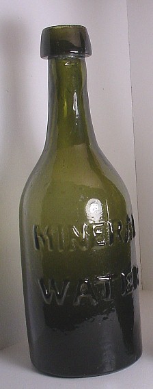
One such bottle is the enigmatic MINERAL / WATER bottle which sold for the surprising sum of over $1000 in an American Bottle Auction last year. I have seen three examples of this bottle in the last 30 years, including the one that I own, which has a much longer neck than the ABA example. In fact, at just under 8" tall, it is nearly the tallest mineral water in the half-pint soda form currently in my collection.
This bottle features the most outrageously crude, oversized, thick and heavily embossed, straight letter font style of any soda form I have ever seen, and I can say without reservation that I know of no other early soda form bearing this exaggerated embossing style. This same characteristic was pointed out by Jeff Wichmann in the description of his consignor's example, back in August of 2009:
"MINERAL WATER with odd kick-up and pontil. We fell in love with this one when it came into the shop. Along with the beautiful olive green coloration, the lettering stands out like a neon sign in Time Square. It has to be the boldest embossing we’ve seen on any bottle and together with the color and crudity, it’s a real looker. The kick up pontil is almost open."
While all 3 examples exhibit the same 1840's style tapered top, that type of top is typical of any number of glasshouses, so no help there.
Then we have the pontil, which is absolutely missing on my example, but is "almost open" on the other. The base on mine is recessed and the bottle is without question 1840's, yet there is no evidence of any iron oxide or scarring of any type. If a sand pontil was employed, it was completely re-fired away. Another oddity, but not characteristic of any particular glasshouse--this simply adds to the mystery.
Last but not least, we have the somewhat unusual olive green color and pebbly exterior glass texture. This is certainly not unheard of, but all wishful thinking aside, it is a color and glass characteristic that quite often occurs in examples of the "CARTER'S / SPANISH / MIXTURE" a Richmond Va. medicine generally attributed to the Baltimore Glassworks. (continue)
